
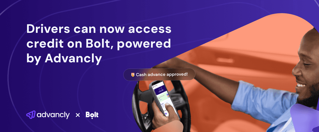
Driving progress by enabling eligible drivers on the Bolt platform to access short-term, low-interest loans.
Mobile Web
Deliverables
Interviews
Competitive Analysis
Personas
User flow
Site map
Low Fidelity Designs
High Fidelity Designs
Team
Product & design
Tools
Figma
Figjam
Duration
6 Months
Introduction
Advancly is a leading fintech company focused on providing credit solutions to various sectors. Recently, Advancly has partnered with Bolt Nigeria to extend financial services to Bolt drivers. This strategic collaboration aims to support drivers’ financial needs, enabling them to receive up-front earnings and boost their productivity. The partnership leverages Advancly’s expertise in credit solutions and Bolt’s expansive driver network to create a seamless integration that benefits both companies and, most importantly, the drivers.
Advancly x Bolt
Advancly
Advancly is a fintech company dedicated to providing innovative credit solutions. The company’s core offering includes a versatile widget that can be embedded onto partner platforms, allowing seamless access to loans for the partners' clients or customers. Advancly’s solutions are designed to be flexible, user-friendly, and tailored to meet the specific needs of its partners.
Bolt
Bolt, originally launched as Taxify in Nigeria in 2016, has grown to become one of the leading ride-hailing services in the country. The company rebranded to Bolt in 2019 and has since expanded its services to include motorbikes, scooters, food, and grocery delivery. Bolt operates in multiple cities across Nigeria, providing a platform where drivers can earn flexibly while offering safe, affordable, and convenient transportation to riders.
Project Background
Before the partnership with Bolt, Advancly utilized a widget that partners could embed onto their platforms to provide loans to their clients. However, Bolt requested a dedicated web application tailored specifically for their drivers. This requirement led to the decision to transform the existing widget into a comprehensive web app. The redesign aimed to enhance the user experience, making it more intuitive and user-friendly for Bolt drivers while maintaining seamless integration with Bolt’s platform.
The Opportunity
Before the partnership with Bolt, Advancly utilized a versatile widget that could be embedded onto the platforms of various partner companies. This widget facilitated the provision of loans to the partners' clients or customers through Advancly's credit solutions. However, with the onset of the partnership with Bolt, there arose a specific request from Bolt to develop a dedicated web application tailored for their drivers. In response to this request, the product manager and the team at Advancly decided to transform the existing widget into a full-fledged web app. This transition marked the beginning of a redesign process aimed at converting the Advancly widget into a more robust and user-friendly web application, ultimately enhancing the accessibility and usability of Advancly’s credit services for Bolt drivers.
Uncovering User needs
For this project, I initiated the user research phase by thoroughly analyzing the existing widget app design and mapping out the best strategies to redesign it for mobile use. This process involved a detailed examination of the current user interface and functionality to identify areas for improvement and adaptation to a mobile-friendly format.
To gain deeper insights, I engaged directly with Bolt drivers to understand their expectations and experiences. Through interviews and surveys, I gathered valuable feedback on their specific needs and pain points. The key user needs identified included:
Ease of access to credit
Available customer support
Transparency of loan terms
Fully optimized for mobile
Fast application process
Who am I designing for?
Based on the research I conducted, I was able to come up with two personas for the project as seen below.

Age: 34
Occupation: Full-time Bolt Driver
Location: Lagos, Nigeria
Bassey, Full-time Bolt Driver
Bassey has been a full-time Bolt driver for the past four years. He relies on his earnings from driving to support his family. Ahmed is tech-savvy and uses his smartphone for navigation, managing ride requests, and staying connected with his customers.
Goals
To secure short-term loans to cover fuel and maintenance costs without interrupting his work schedule.
To have quick and easy access to financial services that can help improve his income stability.
To understand loan terms clearly before committing.
Pain Points
Difficulty in accessing traditional financial services due to irregular income patterns.
Lack of clear information on loan terms and conditions in existing services.
Time-consuming and complex application processes that affect his driving schedule.
Behaviours
Difficulty in accessing traditional financial services due to irregular income patterns.
Lack of clear information on loan terms and conditions in existing services.
Time-consuming and complex application processes that affect his driving schedule.

Age: 28
Occupation: Part-time Bolt Driver and Student
Location: Abuja, Nigeria
Chioma, Part-time Bolt Driver
Chioma is a part-time Bolt driver, balancing her driving hours with her studies at a local university. She drives primarily in the evenings and on weekends to earn extra income to support her education and living expenses.
Goals
To obtain small, manageable loans to cover unexpected expenses and support her academic needs.
To find a flexible financial solution that aligns with her irregular driving schedule and student life.
To enhance her income through better financial management tools.
Pain Points
Challenges in accessing credit due to her part-time driving status and student lifestyle.
Limited time to engage in lengthy loan application processes due to her busy schedule.
Difficulty understanding the loan application requirements and eligibility criteria.
Behaviours
Utilizes mobile applications frequently for both her academic and driving activities.
Prefers financial services that offer flexibility and adaptability to her dual roles as a student and driver.
Looks for user-friendly interfaces and clear instructions to navigate financial products with ease.
Crafting Our Approach
To address the issues discovered through our research and interviews, we developed Point of View (POV) statements and How Might We (HMW) questions. These tools helped us frame the problem from the users' perspectives and guided our brainstorming process to generate actionable solutions.
Point of View Statements
A full-time Bolt driver, needs a quick and straightforward way to apply for loans and clear information on loan terms because he struggles with the complexity and lack of transparency in traditional financial services.
A part-time Bolt driver and student, needs a mobile-optimized application with seamless navigation and accessible customer support because she relies heavily on her smartphone and has limited time to engage in lengthy and complicated processes.
How Might We (HMW) Statements
How might we simplify the loan application process for Bolt drivers, ensuring quick access with clear, transparent information?
How might we optimize the web application for mobile use, providing an intuitive interface, accessible support, and tools to enhance drivers' financial stability?
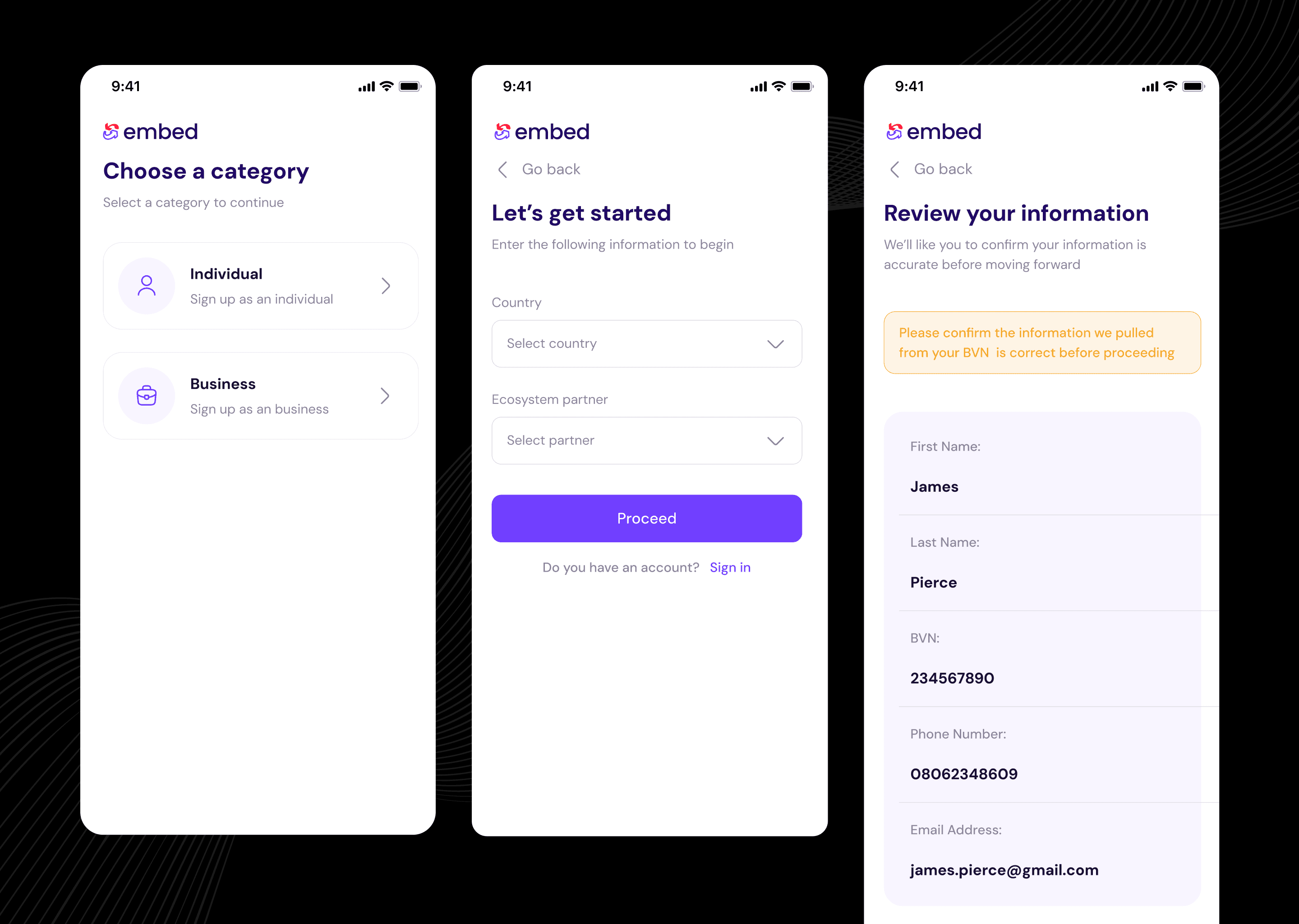
Onboarding
The original design used simple widget cards for the onboarding process, which worked but didn't fully consider the user's needs for easy integration into Bolt's platform. The redesign has turned it into a more advanced and user-friendly web and mobile app. This update came from user feedback, showing the need for a mobile-friendly experience with clear and straightforward steps. While the essential onboarding steps are still there, each one now has a cleaner look, easier navigation, and is optimized for mobile devices. The sections for personal and business information are now more detailed to ensure accuracy and compliance, and the review step helps catch errors before moving forward. Overall, the redesign from a basic widget to a full web app has greatly improved the user experience.
Dashboard
The current widget design is compact, showing the wallet balance, account number, next loan repayment, and quick action buttons for things like repaying a loan or withdrawing money. While it’s simple, it doesn’t show much information or make navigation easy.
The redesigned version for both web and mobile offers a more user-friendly experience. The new layout is bigger and shows more details, including the wallet balance, quick actions, and recent transactions—all in one view. This makes it easier to see important information at a glance and improves how users navigate the app. We’ve also added helpful prompts and detailed transaction histories to make it easier for users to find and use key features. This redesign is focused on creating a more integrated and user-friendly financial tool for Bolt drivers, making it simple and efficient to access credit.

Loans
The difference between the original loan page and the redesigned version for web and mobile is very noticeable. The original widget was basic, with limited options—it only allowed users to request a new loan or view their loan history, which didn’t offer much in terms of engagement or information.
In contrast, the redesigned loan page is much more dynamic and user-friendly. It provides clear details about outstanding repayments, a detailed loan history with status updates, and a full breakdown of recent transactions. This redesign was created to give Bolt drivers a stronger and easier-to-use platform for managing their loans. We made these changes based on direct feedback from Bolt drivers and modern design practices to ensure they can easily manage their loans and clearly understand their financial situation.

Loan Request
The original widget design was simple and easy to use, allowing users to request loans and view their loan history without much hassle. While it was clear and straightforward, it didn’t offer much in terms of a richer or more engaging experience.
The new design makes a big improvement. It goes beyond just the basics by guiding users through the loan request process with more clarity and detail. Now, the flow includes a full range of loan offers, detailed terms and agreements, options to set up direct debit accounts, and several repayment methods. This approach makes sure users are well-informed and confident in their loan choices.
Visually, the redesign aims to make it easier for users to navigate and complete their tasks. It's not just about adding more features; it's about creating a more user-friendly experience that fixes the limitations of the old design and meets the changing needs of our users.

Profile
The original widget profile screen is simple and straightforward, allowing users to quickly edit profile information, update card details, manage direct debit accounts, set a transaction PIN, and link bank statements. It’s efficient and perfect for quick updates or checks.
For the redesign, we focused on making the experience more engaging and user-friendly. We introduced a clean, organized layout that separates different sections—like personal information, bank statements, and card details—into distinct tabs. This makes it easy for users to find and update what they need.
Here’s what we had in mind for the redesign:
Better Usability: By organizing sections into tabs, the interface is less cluttered and easier to navigate. Users can focus on one task at a time without feeling overwhelmed.
Consistent Experience: The redesign looks and feels the same across both web and mobile platforms, so users have a smooth experience whether they’re on a computer or a mobile device.
Improved Visual Hierarchy: Important details like the user’s name, email, and phone number are prominently displayed, making it easy to verify and update information. This design helps guide users to the most important areas first.
Modern Look: The new design uses modern principles like ample white space, clean lines, and a simple color palette. This not only makes the interface look better but also makes it easier to use.
User Feedback: The redesign is based on feedback from users who wanted a more organized and less cluttered profile management experience. By addressing these issues, we’ve made the interface more user-friendly.
Overall, the redesign aims to improve the user experience by making profile management more intuitive, organized, and visually appealing. This helps users manage their profiles more easily, leading to higher satisfaction and better engagement with the platform.

Usability Testing
Usability testing was a crucial component in validating our design decisions and ensuring the new interface met user needs effectively. We conducted several rounds of usability testing with diverse user groups to gather comprehensive feedback and refine the design accordingly.
Process:
User Selection: We selected a diverse group of users, including both existing users familiar with the old interface and new users with no prior experience. This allowed us to capture a wide range of perspectives and identify potential usability issues from different user demographics.
Scenario-Based Tasks: Participants were asked to complete specific tasks that reflect real-world usage, such as:
Applying for a loan
Repaying a loan
Adding a new card
Managing direct debit accounts These tasks were designed to highlight any pain points or areas of confusion.
Observation and Feedback: During the tests, we observed users’ interactions with the interface, noting any difficulties they encountered. We also gathered direct feedback through post-task interviews and surveys to understand their thoughts and feelings about the new design.
Findings:
Applying for a Loan: Users appreciated the streamlined process and clear instructions, which made it easy to apply for a loan. The step-by-step flow reduced confusion and improved overall satisfaction.
Repaying a Loan: Initial feedback revealed some confusion in the repayment process, leading us to rework the flow. As a result, we implemented a new, shorter repayment flow accessible directly from the dashboard. This change significantly enhanced the user experience by reducing the steps required to complete a loan repayment.
Adding a New Card: Users found the card addition process intuitive, with clear prompts and easy-to-follow steps.
Managing Direct Debit Accounts: The management of direct debit accounts was simplified, and users appreciated the ability to update their information seamlessly.
Measuring Success
To measure the success of our redesign, we established several key performance indicators (KPIs) and set up analytics to track user interactions and engagement.
KPIs:
User Engagement: Monitoring metrics such as the time spent on the profile page and the number of profile updates made, compared to the previous design.
Task Completion Rate: Tracking the success rate of specific tasks (e.g., applying for a loan, repaying a loan) to ensure users could complete these actions efficiently.
User Satisfaction: Regular user surveys and feedback forms to gauge overall satisfaction with the new design, capturing qualitative insights into user experiences.
Support Requests: Monitoring the number and nature of support requests related to profile management, aiming for a reduction in issues reported by users.
Results:
Increased Engagement: There was a notable increase in user engagement, with more users spending time on the profile page and making updates more frequently.
High Task Completion Rates: The task completion rate improved significantly, with most users able to complete tasks without any assistance.
Positive User Feedback: User satisfaction scores were high, with many users expressing appreciation for the improved design and ease of use.
Reduced Support Requests: The number of support requests related to profile management decreased, indicating that users were finding the new interface intuitive and easy to navigate.