

Overview
Shara CRM Web Platform
Context
Internal fintech operations and merchant management platform
Users
Operations teams, finance admins, support agents, internal managers
Lead Product Designer, end-to-end redesign
Scope
Workflow redesign, information architecture, system patterns, UI components
Output
Cut admin review and approval times by 50% and created a scalable foundation for future operational tools
Background
Shara’s CRM supports critical internal operations, including merchant onboarding, account reviews, transaction monitoring, and support workflows.
As the product scaled, the CRM grew organically. New features were added without a clear system, leading to fragmented workflows, inconsistent patterns, and heavy reliance on manual workarounds.
Operational inefficiency became a bottleneck.
Admins spent too much time navigating screens, verifying information, and switching contexts. Errors were costly and slowed down merchant activation and issue resolution.
The redesign focused on restoring clarity, reducing operational friction, and preparing the platform for scale.
Fragmented merchant workflows created bottlenecks
Admin teams navigated 7 different systems to review a single merchant application. Critical information was scattered across multiple tools.
The existing CRM struggled in three key areas:
❌
Fragmented workflows spread across multiple screens
❌
Inconsistent layouts and action placement
❌
Poor visibility into status, ownership, and next steps
These issues increased review time, caused mistakes, and made onboarding new team members difficult.
Fragmented review workflow
→ Applications split across 7 stages
→ Same table layout repeated across stages
→ Officers scrolled and jumped between tables
→ Status required manual cross checking
Impact
A single review took 15 plus minutes due to navigation overhead. Officers could not see application progress end to end, which slowed decisions and increased cognitive load.
Decision data buried in the interface
→ Risk signals hidden in collapsed sections
→ Routine fields and approval critical data looked the same
→ Decision actions appeared only at the bottom
Impact
Officers scanned long text blocks to detect risk. Signals like outstanding debt and failed checks were easy to miss, leading to inconsistent approvals.
Goals
The redesign focused on measurable operational outcomes.
🎯
Reduce admin review and approval time
🎯
Improve clarity of task status and ownership
🎯
Minimise errors caused by context switching
🎯
Create reusable patterns for future features
🎯
Support fast onboarding of new internal users
Discovery and Key Insights
Through stakeholder conversations and workflow walkthroughs, a few patterns emerged. The core issue was not visual quality. It was workflow design.

Design Strategy
I shifted the platform from a screen-based structure to a workflow-driven system.
Key principles guided the redesign:
• Design around tasks, not pages
• Surface critical information early
• Standardise interaction patterns
• Reduce cognitive load during reviews
• Make system state obvious at all times
This allowed the CRM to feel predictable, faster, and easier to trust.

Priority-driven information architecture
Redesigned dashboard surfaces pending work first. Alerts and quick actions reduce navigation depth.
The home screen was restructured to highlight what admins needed most: pending applications, average processing times, and conversion rates. Risk alerts and pending activations were surfaced upfront, reducing the time admins spent searching.

Structured merchant detail view
Organized merchant information into logical sections. Reduced cognitive load by grouping related data.
One of the biggest pain points in the old CRM was the user menu. It was inconsistent, and critical merchant details were spread across multiple tabs with little structure. Admins had to click through different sections repeatedly to build a complete profile.
The redesign introduced a well-structured, tab-based layout that grouped merchant data into clear categories:
Overview: general merchant information, activity history, and credit products.
Wallets: account balances and virtual account details.
Limit Management: credit scores, revenue, risk data, and assigned limits.
Applications: documents, comments, and approval trail.
Transactions & Support: history and case management.
This approach turned the user menu into a single source of truth for each merchant, giving admins everything they needed in one place. It reduced time spent searching for details and improved the accuracy of decisions.


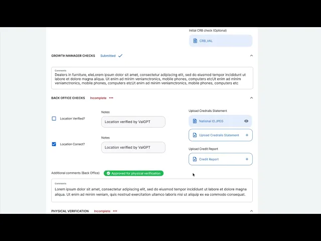
Safe approval decisions
The review process was transformed into a structured, multi-step journey. Admins could now:
Upload and review documents like IDs and bank statements directly in the CRM.
Leave comments visible across different admin levels, creating a clear trail of decisions.
Take decisive actions—reject, request more info, or escalate for final approval—with fewer clicks.
This change eliminated the need for external tools and gave admins all the context they needed in one place.

Merchant list with powerful filtering
The review process was transformed into a structured, multi-step journey. Admins could now:
Upload and review documents like IDs and bank statements directly in the CRM.
Leave comments visible across different admin levels, creating a clear trail of decisions.
Take decisive actions—reject, request more info, or escalate for final approval—with fewer clicks.
This change eliminated the need for external tools and gave admins all the context they needed in one place.

Loan Applications
Loan data was centralized into a single, filterable table with application status, approved limits, and activity logs. This streamlined what had previously been a fragmented and time-consuming search process.

Every improvement required compromise. These decisions aligned with long-term scalability, not short-term convenience.
🧭
Chose clarity over dense information in critical flows
🧭
Deferred advanced customisation to protect system consistency
🧭
Accepted slightly more clicks in exchange for fewer errors
🧭
Prioritised system foundations over feature expansion
The redesign delivered clear operational improvements. The platform became a reliable internal tool rather than a productivity blocker.
📈
Reduced admin review and approval times by 50%
📈
Faster task discovery and completion
📈
Lower cognitive load for daily operations
📈
Easier onboarding for new team members
📈
A scalable system for future CRM features
This project reinforced the importance of workflow-first design in internal tools.
I learned that:
✅
Systems thinking outlives individual screens
✅
Consistency builds trust in high-risk products
✅
Good internal tools directly impact business growth
It also shaped how I approach platform design today, focusing on clarity, leverage, and long-term scalability.